25 Jul 20247 minute read


Rachel Ilan Simpson
Experimenting with Claude 3.5's New Artifacts Feature: A Designer's Journey
25 Jul 20247 minute read

So, I recently took Claude 3.5’s new Artifacts feature for a spin, aiming to build real React-based prototypes. As a designer with over a decade of experience, but without much hands-on React knowledge, this was both exciting and daunting. Let’s dive into how it went!
The Starting Point
I began with an example from Kevin Cannon, who shared a short video of making a clickable, semi-functional compound interest calculator app with Claude. To give you some context, I dabbled in HTML, CSS, and a bit of PHP back in the day, but React is a whole new beast for me. At Tessl, we’ve chosen Radix as our main component library, so my first goal was to build a basic app prototype with Radix instead of shadcn.
The Initial Struggles
Copying Kevin’s prompt was easy to set up (If you want to give it a try, here’s how you enable the feature), and run as shown:
Create a code artifact of a react shadcn appBut getting it to work with Radix was another story. I immediately hit a wall with errors that I couldn’t decipher. Each attempt led to more missing or unsupported library errors. Just when I was about to throw in the towel and ask a developer for help, I decided to consult Claude itself.

A Bittersweet Success
Claude managed to solve the problem – kind of. It created the dashboard I asked for, but solved the problem by replacing Radix components with shadcn. While getting the prototype built quickly was a small victory, it wasn’t the solution I wanted. It seems like there’s a constraint on the environment that prevents using Radix (but if anyone knows more, please let us know). This means I'd still need to involve our engineering team. There's talk about creating a custom instance of Claude to support Radix, which could be a game-changer for our UX work.
The Bigger Picture
If Claude doesn’t work with Radix, it's a setback since we've committed to using it. But this experiment highlighted something crucial: AI tools' potential to become integral to practical workflows, not just for developers but for everyone involved in creating complex software. With the supported shadcn components, I was able to iterate further and build a simple, interactive front-end dashboard prototype with elements like graphs and a dark mode, all in a matter of minutes. And honestly, it was pretty fun. Here’s what it looked like after 13 rounds of feedback:
Trying Something Simpler
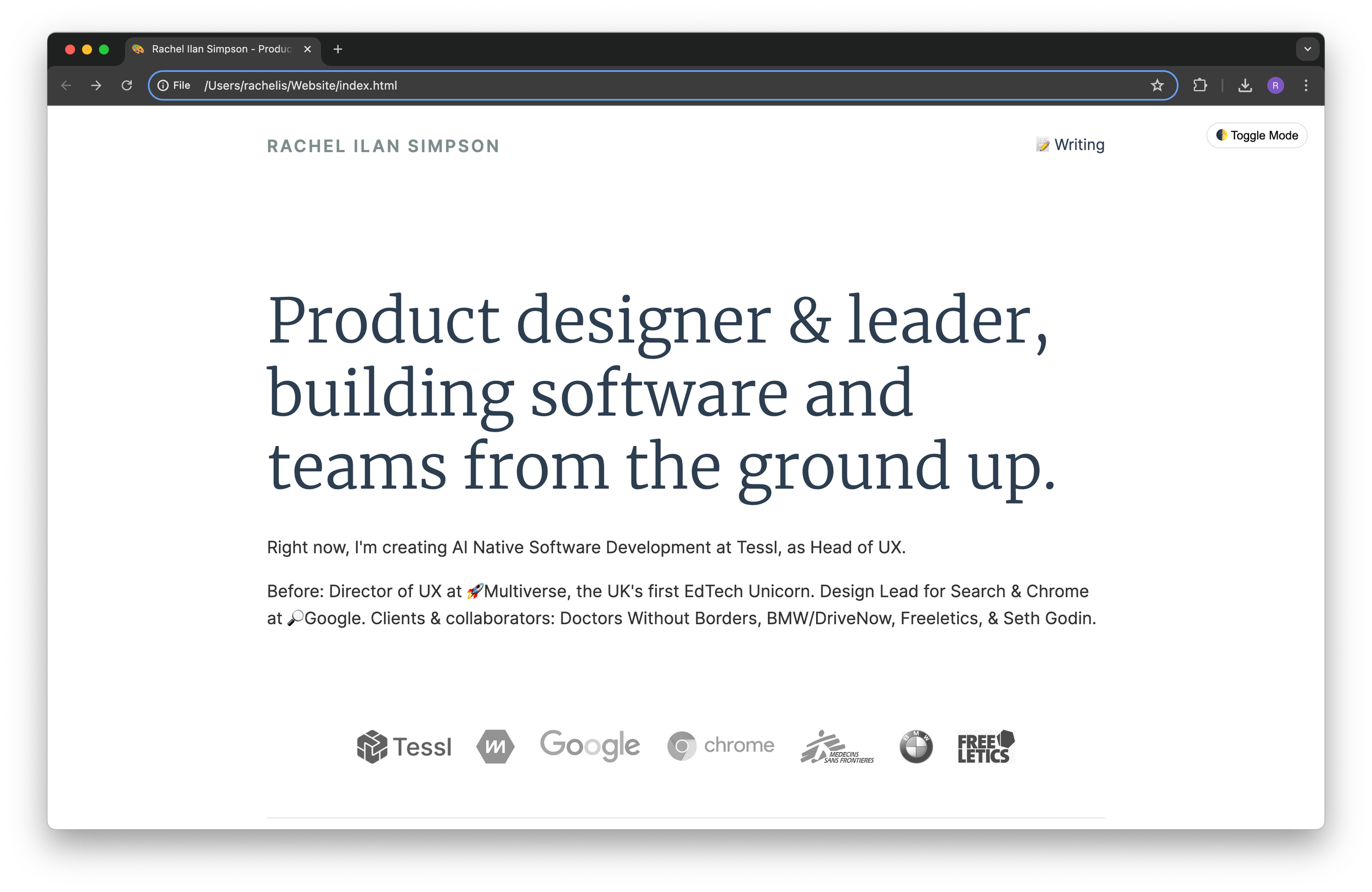
Alongside this project, I created a personal homepage using HTML/CSS. This was more straightforward, and it gave me more control over visual design elements without being tied to a particular component library.
I provided content, and Claude quickly generated the page structure in both design and code. It was fast! However, the visual design required a lot of feedback. The font rendering also tripped me up—Claude claimed to load a Google Font, but it didn’t actually happen.
Pros and Cons
Designing in Figma and then building it out is a slow process, with gaps between what’s possible in design and implementation at times, so this is a faster and more aligned alternative. Despite some fiddling, I had a functional website in a short time which lined up with my design goals. The most exciting part was quickly adding more complex features like a dark mode toggle to the website. It was fun. Workflow challenges are a key barrier at the moment.
One annoying aspect was being unable to edit the code directly in the editor for small changes, like tweaking copy. Each small change required asking Claude to regenerate the whole thing, turning what would be a two-second tweak in Figma into a 10-second wait. Stacking up small changes seemed more likely to result in errors. Copy-pasting the code out is a workaround, but it didn’t fit seamlessly into the workflow. Not being able to add or automatically pull in assets was a significant inconvenience as well, so I ended up working between VS Code and Claude.
Iteration Challenges
Iterating between Claude and a VS Code window became tedious. When Claude would only update part of the code and say, “the rest is the same,” I had to manually piece everything together, or ask it to re-add the rest of the code, which would sometimes break everything requiring a rollback. This back-and-forth took away some of the magic of quick iteration.
I also hit limits on the number of messages per day and the length limit for the chat, which added another layer of frustration. With the more complex react project, iterations after round 10 got slower to run. Ultimately I hit the content window limit at iteration 73 on the website and struggled to move this into another conversation smoothly.

Go see the updated version of my website, built with Claude 3.5
Wrapping Up
Experimenting with Claude 3.5’s Artifacts feature was an enlightening experience. It showcased the potential for AI tools in design workflows, highlighted current limitations, and pointed to exciting future possibilities. It’s clear that once we can plug tools like this into our existing design systems, it’ll be a big unlock. While it’s not yet at the level of replacing front-end developers or products like squarespace, it’s an intriguing tool that will significantly change (and hopefully enhance) our design process as it continues to evolve.
Join Our Newsletter
Be the first to hear about events, news and product updates from AI Native Dev.
